# Autocomplete.js
This JavaScript library adds a fast and fully-featured auto-completion menu to your search box displaying results "as you type". It can easily be combined with Algolia's realtime search engine. The library is available as a jQuery plugin, an Angular.js directive or a standalone library.
[](http://travis-ci.org/algolia/autocomplete.js)
[](http://badge.fury.io/js/autocomplete.js)
[](https://coveralls.io/r/algolia/autocomplete.js?branch=master)
[](https://www.jsdelivr.com/package/npm/autocomplete.js)


[](https://opensource.org/licenses/MIT)
[](https://saucelabs.com/u/opensauce-algolia)
## Table of Contents
- [Features](#features)
- [Installation](#installation)
- [jsDelivr](#jsdelivr)
- [cdnjs](#cdnjs)
- [npm](#npm)
- [Bower](#bower)
- [Source dist/](#source-dist)
- [Browserify](#browserify)
- [Usage](#usage)
- [Standalone](#standalone)
- [jQuery](#jquery)
- [Angular.JS](#angularjs)
- [Look and Feel](#look-and-feel)
- [Global Options](#global-options)
- [Datasets](#datasets)
- [Sources](#sources)
- [Hits](#hits)
- [PopularIn (aka "xxxxx in yyyyy")](#popularin-aka-xxxxx-in-yyyyy)
- [Custom source](#custom-source)
- [Security](#security)
- [User-generated data: protecting against XSS](#user-generated-data-protecting-against-xss)
- [FAQ](#faq)
- [How can I `Control`-click on results and have them open in a new tab?](#how-can-i-control-click-on-results-and-have-them-open-in-a-new-tab)
- [Events](#events)
- [API](#api)
- [jQuery](#jquery-1)
- [Standalone](#standalone-1)
- [Contributing & releasing](#contributing--releasing)
- [Credits](#credits)
## Features
* Displays suggestions to end-users as they type
* Shows top suggestion as a hint (i.e. background text)
* Supports custom templates to allow for UI flexibility
* Works well with RTL languages and input method editors
* Triggers custom events
## Installation
The `autocomplete.js` library must be included **after** jQuery, Zepto or Angular.js (with jQuery).
### jsDelivr
```html
```
### cdnjs
```html
```
### npm
```sh
npm install --save autocomplete.js
```
### Bower
```sh
bower install algolia-autocomplete.js -S
```
### Source dist/
You can find the built version in [dist/](https://github.com/algolia/autocomplete.js/tree/master/dist).
### Browserify
You can require it and use [Browserify](http://browserify.org/):
```js
var autocomplete = require('autocomplete.js');
```
## Usage
### Standalone
1. Include `autocomplete.min.js`
1. Initialize the auto-completion menu calling the `autocomplete` function
```html
```
### jQuery
1. Include `autocomplete.jquery.min.js` after including `jQuery`
1. Initialize the auto-completion menu calling the `autocomplete` jQuery plugin
```html
```
### Angular.JS
1. Include `autocomplete.angular.min.js` after including `jQuery` & `Angular.js`
1. Inject the `algolia.autocomplete` module
1. Add the `autocomplete`, `aa-datasets` and the optional `aa-options` attribute to your search bar
```html
```
**Note:** You need to rely on `jQuery`, the lite version embedded in Angular.js won't work.
## Look and Feel
Below is a faux mustache template describing the DOM structure of an autocomplete
dropdown menu. Keep in mind that `header`, `footer`, `suggestion`, and `empty`
come from the provided templates detailed [here](#datasets).
```html
{{#datasets}}
{{/datasets}}
{{empty}}
```
When an end-user mouses or keys over a `.aa-suggestion`, the class `aa-cursor` will be added to it. You can use this class as a hook for styling the "under cursor" state of suggestions.
Add the following CSS rules to add a default style:
```css
.algolia-autocomplete {
width: 100%;
}
.algolia-autocomplete .aa-input, .algolia-autocomplete .aa-hint {
width: 100%;
}
.algolia-autocomplete .aa-hint {
color: #999;
}
.algolia-autocomplete .aa-dropdown-menu {
width: 100%;
background-color: #fff;
border: 1px solid #999;
border-top: none;
}
.algolia-autocomplete .aa-dropdown-menu .aa-suggestion {
cursor: pointer;
padding: 5px 4px;
}
.algolia-autocomplete .aa-dropdown-menu .aa-suggestion.aa-cursor {
background-color: #B2D7FF;
}
.algolia-autocomplete .aa-dropdown-menu .aa-suggestion em {
font-weight: bold;
font-style: normal;
}
```
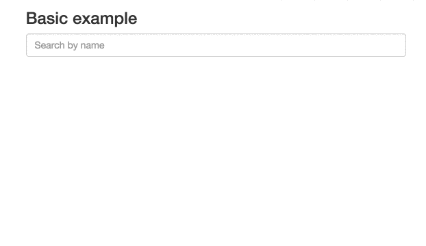
Here is what the [basic example](https://github.com/algolia/autocomplete.js/tree/master/examples) looks like:
## Global Options
When initializing an autocomplete, there are a number of global options you can configure.
* `autoselect` – If `true`, the first rendered suggestion in the dropdown will automatically have the `cursor` class, and pressing `` will select it.
* `autoselectOnBlur` – If `true`, when the input is blurred, the first rendered suggestion in the dropdown will automatically have the `cursor` class, and pressing `` will select it. This option should be used on mobile, see [#113](https://github.com/algolia/autocomplete.js/issues/113)
* `tabAutocomplete` – If `true`, pressing tab will select the first rendered suggestion in the dropdown. Defaults to `true`.
* `hint` – If `false`, the autocomplete will not show a hint. Defaults to `true`.
* `debug` – If `true`, the autocomplete will not close on `blur`. Defaults to `false`.
* `clearOnSelected` – If `true`, the autocomplete will empty the search box when a suggestion is selected. This is useful if you want to use this as a way to input tags using the `selected` event.
* `openOnFocus` – If `true`, the dropdown menu will open when the input is focused. Defaults to `false`.
* `appendTo` – If set with a DOM selector, doesn't wrap the input and appends the wrapper and dropdown menu to the first DOM element matching the selector. It automatically positions the wrapper under the input, and sets it to the same width as the input. Can't be used with `hint: true`, because `hint` requires the wrapper around the input.
* `dropdownMenuContainer` – If set with a DOM selector, it overrides the container of the dropdown menu.
* `templates` – An optional hash overriding the default templates.
* `dropdownMenu` – the dropdown menu template. The template should include all *dataset* placeholders.
* `header` – the header to prepend to the dropdown menu
* `footer` – the footer to append to the dropdown menu
* `empty` – the template to display when none of the datasets are returning results. The templating function
is called with a context containing the underlying `query`.
* `cssClasses` – An optional hash overriding the default css classes.
* `root` – the root classes. Defaults to `algolia-autocomplete`.
* `prefix` – the CSS class prefix of all nested elements. Defaults to `aa`.
* `noPrefix` - set this to true if you wish to not use any prefix. Without this option, all nested elements classes will have a leading dash. Defaults to `false`.
* `dropdownMenu` – the dropdown menu CSS class. Defaults to `dropdown-menu`.
* `input` – the input CSS class. Defaults to `input`.
* `hint` – the hint CSS class. Defaults to `hint`.
* `suggestions` – the suggestions list CSS class. Defaults to `suggestions`.
* `suggestion` – the suggestion wrapper CSS class. Defaults to `suggestion`.
* `cursor` – the cursor CSS class. Defaults to `cursor`.
* `dataset` – the dataset CSS class. Defaults to `dataset`.
* `empty` – the empty CSS class. Defaults to `empty`.
* `keyboardShortcuts` - Array of shortcut that will focus the input. For example if you want to bind `s` and `/`
you can specify: `keyboardShortcuts: ['s', '/']`
* `ariaLabel` - An optional string that will populate the `aria-label` attribute.
```html
```
* `minLength` – The minimum character length needed before suggestions start
getting rendered. Defaults to `1`.
* `autoWidth` – This option allow you to control the width of autocomplete wrapper. When `false` the autocomplete wrapper will not have the width style attribute and you are be able to put your specific width property in your css to control the wrapper. Default value is `true`.
One scenario for use this option. e.g. You have a `max-width` css attribute in your `autocomplete-dropdown-menu` and you need to width grows until fill the `max-width`. In this scenario you put a `width: auto` in your autocomplete wrapper css class and the `max-width` in your autocomplete dropdown class and all done.
## Datasets
An autocomplete is composed of one or more datasets. When an end-user modifies the
value of the underlying input, each dataset will attempt to render suggestions for the
new value.
Datasets can be configured using the following options.
* `source` – The backing data source for suggestions. Expected to be a function
with the signature `(query, cb)`. It is expected that the function will
compute the suggestion set (i.e. an array of JavaScript objects) for `query`
and then invoke `cb` with said set. `cb` can be invoked synchronously or
asynchronously.
* `name` – The name of the dataset. This will be appended to `tt-dataset-` to
form the class name of the containing DOM element. Must only consist of
underscores, dashes, letters (`a-z`), and numbers. Defaults to a random
number.
* `displayKey` – For a given suggestion object, determines the string
representation of it. This will be used when setting the value of the input
control after a suggestion is selected. Can be either a key string or a
function that transforms a suggestion object into a string. Defaults to
`value`.
Example function usage: `displayKey: function(suggestion) { return suggestion.nickname || suggestion.firstName }`
* `templates` – A hash of templates to be used when rendering the dataset. Note
a precompiled template is a function that takes a JavaScript object as its
first argument and returns a HTML string.
* `empty` – Rendered when `0` suggestions are available for the given query.
Can be either a HTML string or a precompiled template. The templating function
is called with a context containing `query`, `isEmpty`, and any optional
arguments that may have been forwarded by the source:
`function emptyTemplate({ query, isEmpty }, [forwarded args])`.
* `footer` – Rendered at the bottom of the dataset. Can be either a HTML
string or a precompiled template. The templating function
is called with a context containing `query`, `isEmpty`, and any optional
arguments that may have been forwarded by the source:
`function footerTemplate({ query, isEmpty }, [forwarded args])`.
* `header` – Rendered at the top of the dataset. Can be either a HTML string
or a precompiled template. The templating function
is called with a context containing `query`, `isEmpty`, and any optional
arguments that may have been forwarded by the source:
`function headerTemplate({ query, isEmpty }, [forwarded args])`.
* `suggestion` – Used to render a single suggestion. The templating function
is called with the `suggestion`, and any optional arguments that may have
been forwarded by the source: `function suggestionTemplate(suggestion, [forwarded args])`.
Defaults to the value of `displayKey` wrapped in a `p` tag i.e. `